Unite The City
A new community service initiative from K-LOVE, Unite The City uniquely pairs service projects with tour stops from your favorite Christian music artists. By partnering with local non-profits, Unite The City events aim to leave a lasting impact by mobilizing fans to give back to their communities.
The Brief
Create a logo for Unite The City. This should be a stand-alone logo, but must pair well well with K-LOVE and Air1 logos when necessary. Could be a simple wordmark or include a symbol.
The Process
This logo would need to be flexible, so the simpler the better. I provided 3 different logo options:
The first option paired a clean, bold sans-serif font with a grungy brush font. This pairing visually captured the concept of cleaning up the city (grunge vs. clean), and could be easily combined with city imagery for each event location.
The second option was more active and stylized, inspiring action by skewing the font. When combined with a fun, retro aesthetic, the logo really comes to life.
The third option introduces a symbol, paired with a clean sans-serif font. The symbol meaning is three-fold: the “U” shape for “Unite”, the tops represent buildings, and the unity point where they come together.
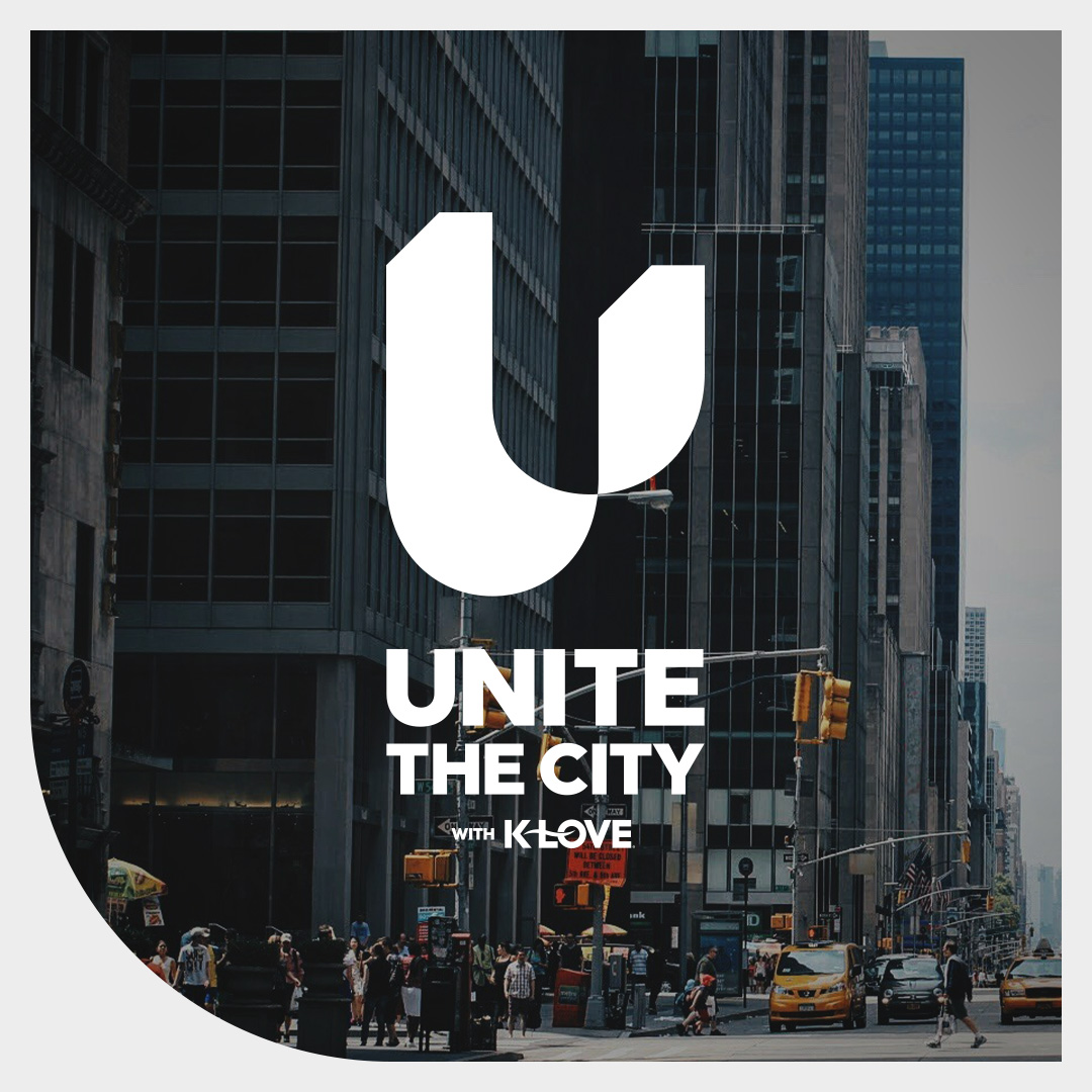
Each option was accompanied by a simple mockup of how they could be used.
Option 3 was the clear winner, and with just a few small tweaks the logo was complete.
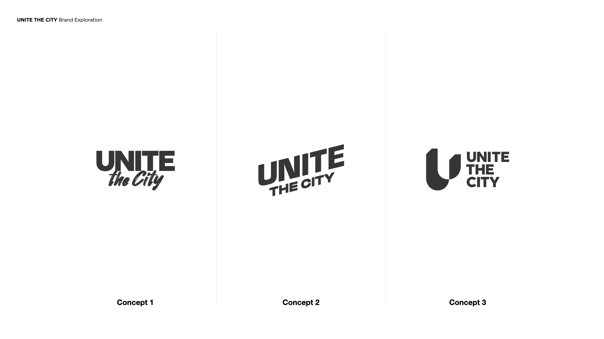
The 3 logo options presented to the client.
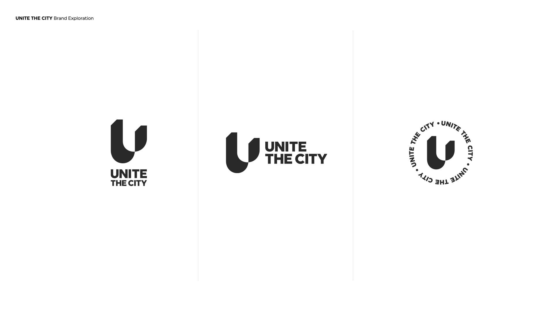
Variations of the final Unite The City logo
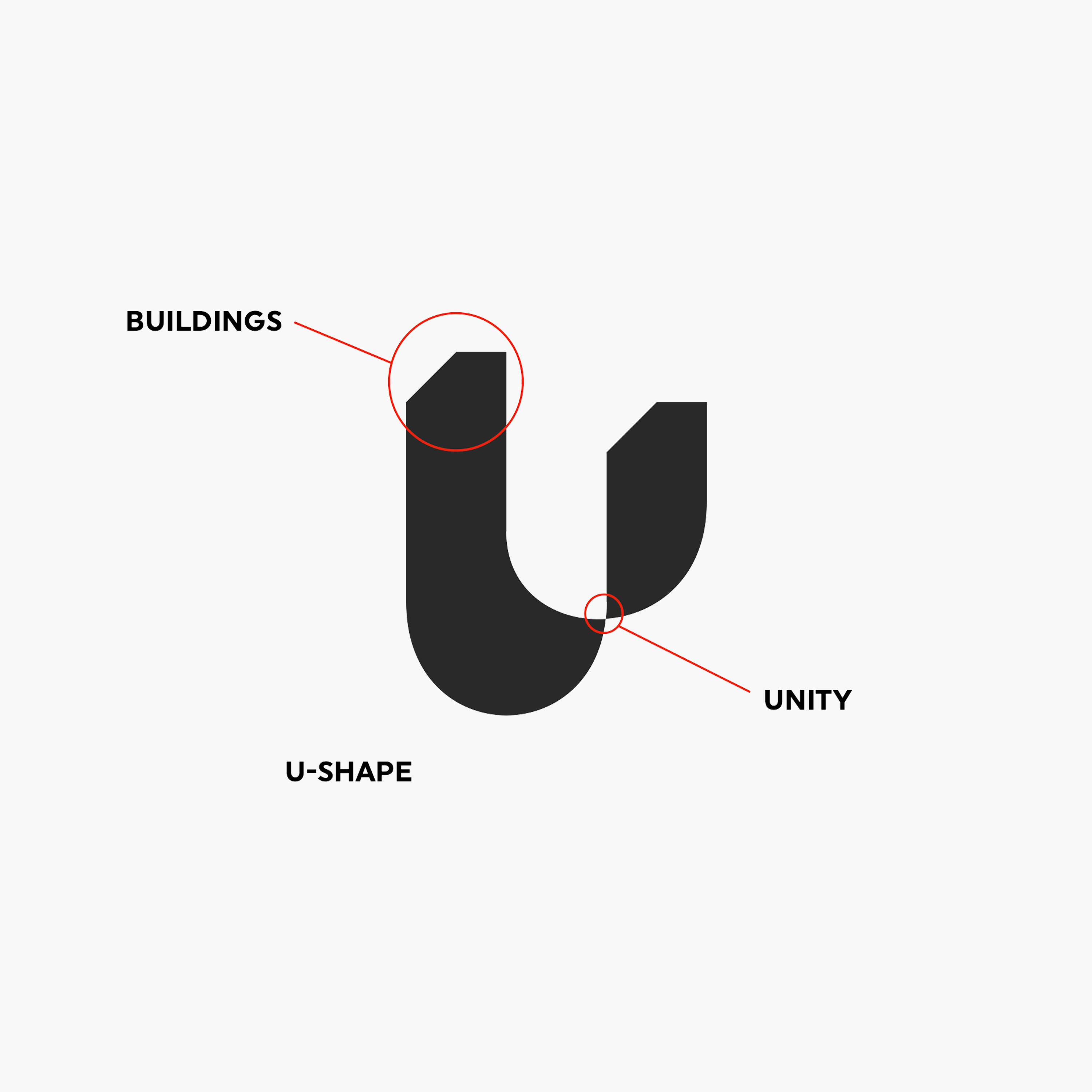
The anatomy of the "U" symbol design.
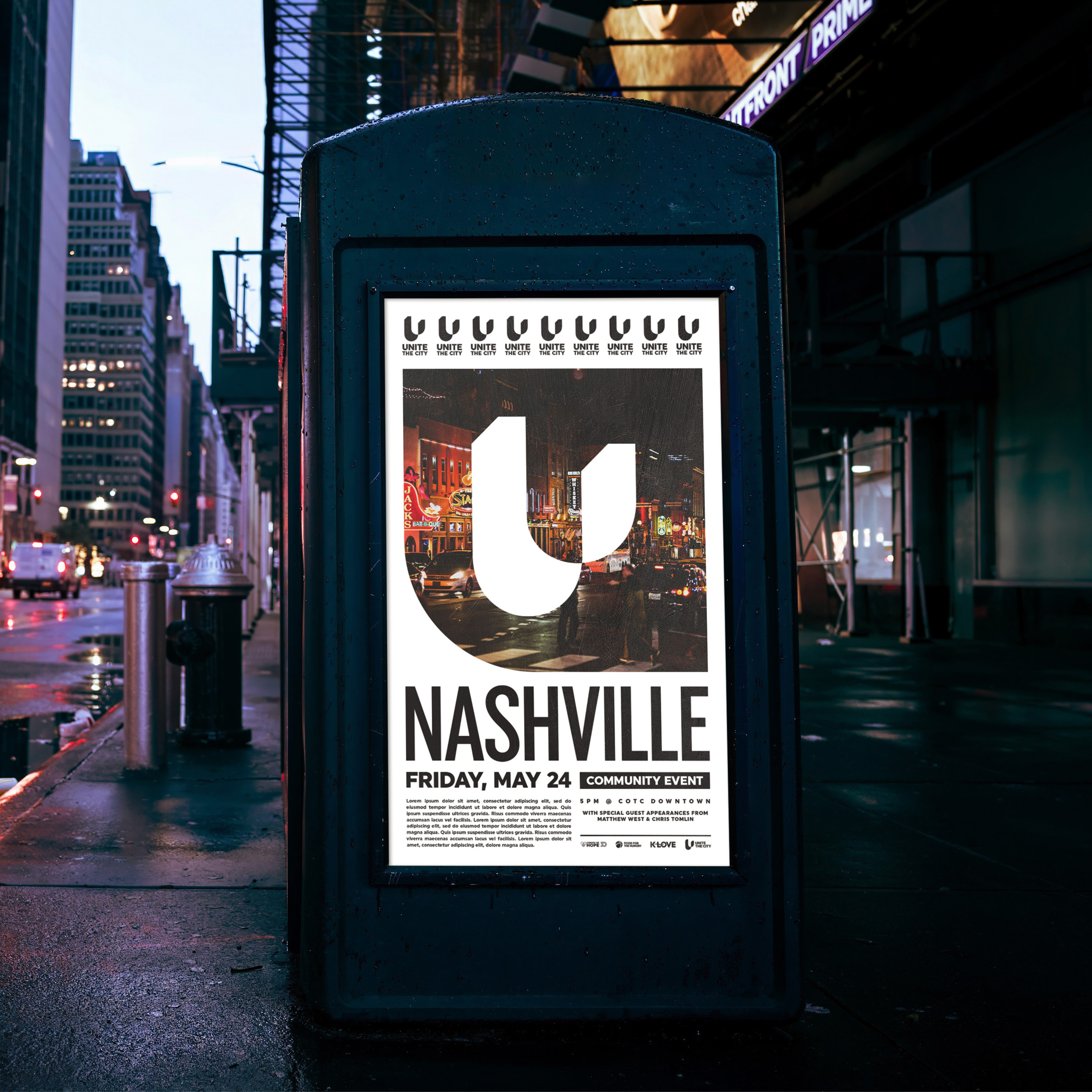
A mockup of a poster design for Unite The City
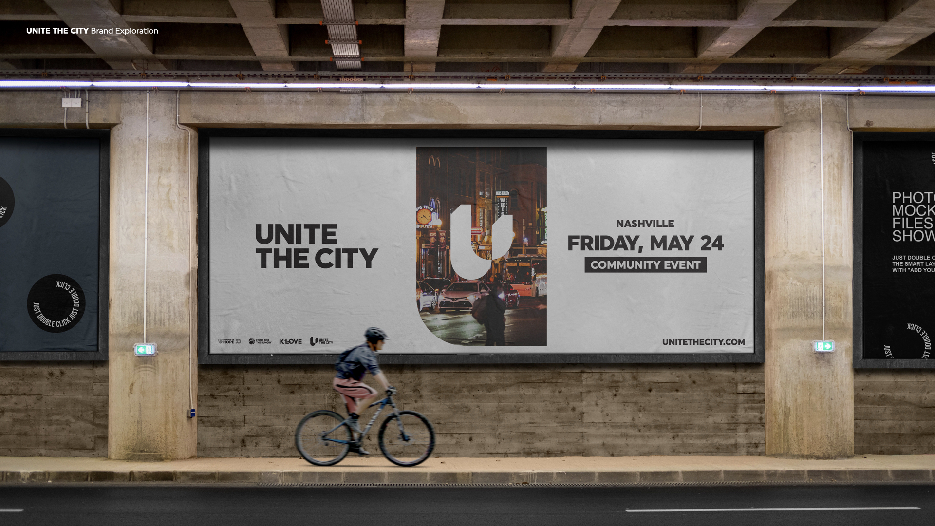
A billboard mockup for Unite The City.
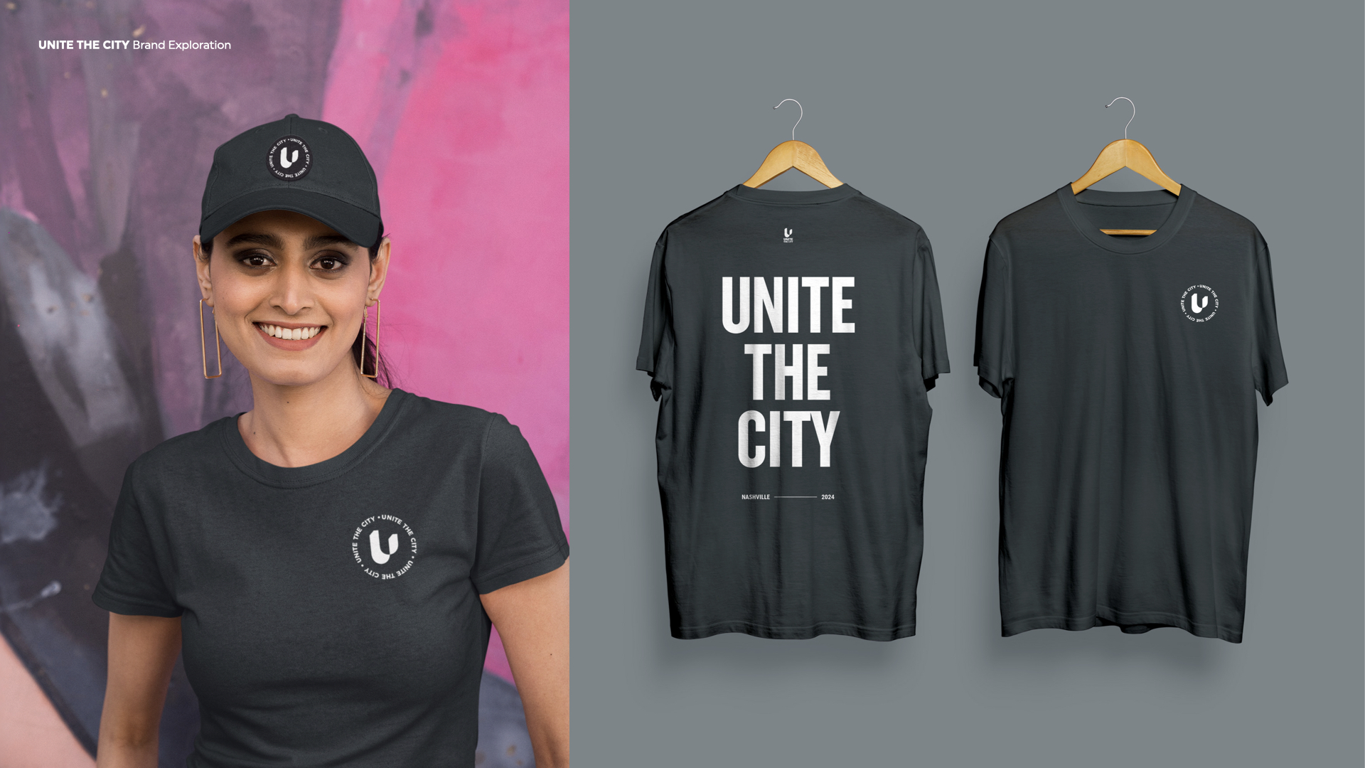
Merch mockups for Unite The City.
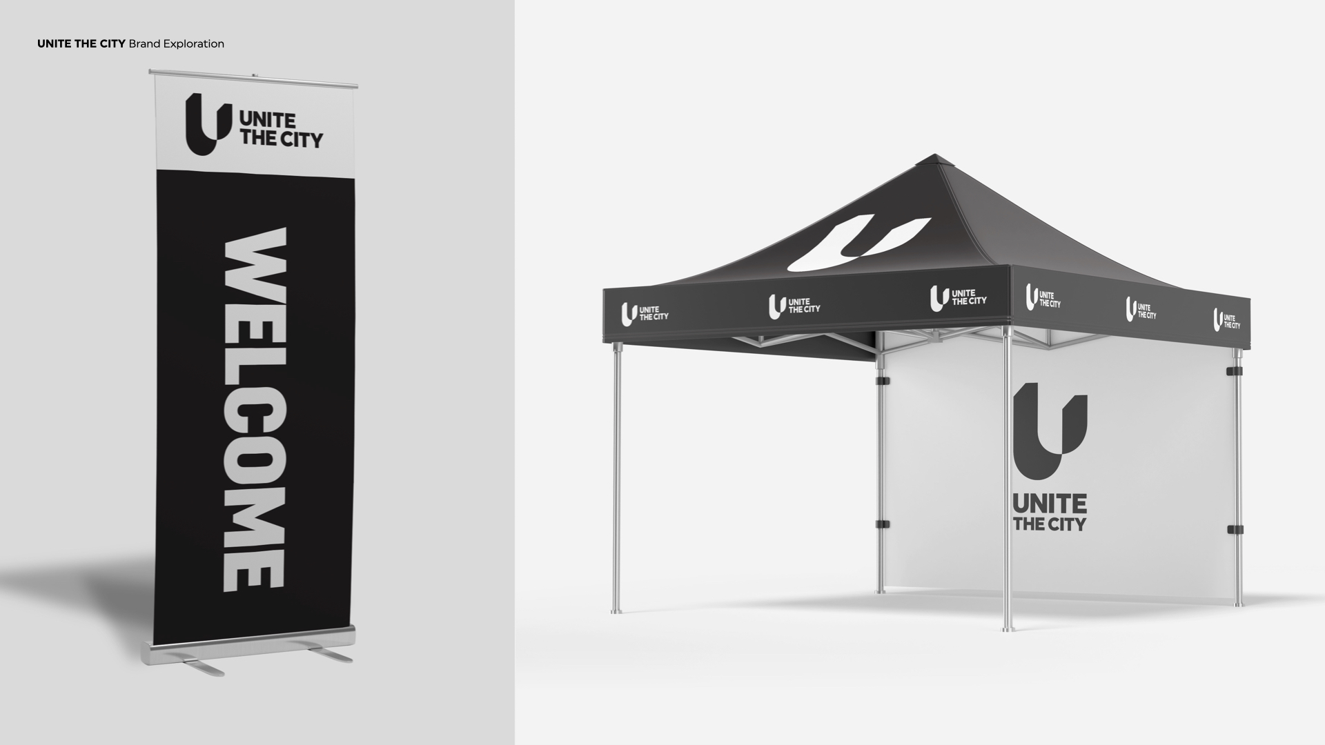
Booth display mockup for Unite The City