Sanctuary Studios
Writing and producing music is a vulnerable process, and sometimes artists need a safe place to flesh out their ideas. Sanctuary Studios is a project from Moriah and Joel Smallbone to provide just that: a safe, unburdened environment where creatives can create authentically.
The Brief
Create a logo for Sanctuary Studios that uses depth and dimension. Should feel earthy and grounded. Needs to communicate safety, sacredness and authenticity. Ideally would have depth and dimension.
The Process
A carefully curated Pinterest board helped get this project started. I explored a few different directions, tapping into different “sanctuary” and “faith” related imagery, all with an isometric perspective to achieve the depth and dimension.
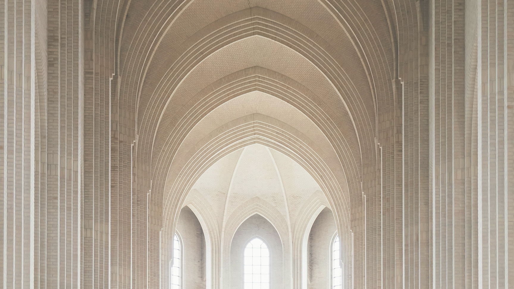
The strongest direction was influenced by vaulted ceilings as seen in catholic cathedrals. This direction really leaned into that isometric perspective, and included some really cool repeating shapes.
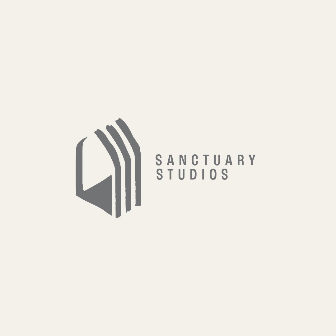
We continued to refine and simplify, and ultimately added a tasteful rough texture to bring in that earthy, grounded feel. A condensed sans-serif font with generous tracking rounded out the logo, and a very soft, neutral color pallet brought it all together.
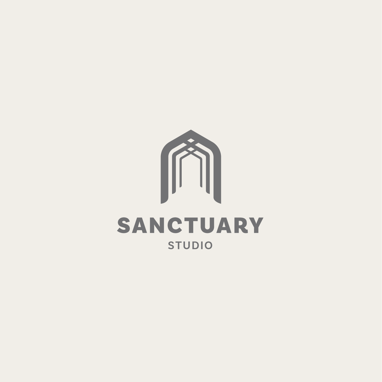
One of the initial concepts for the logo.
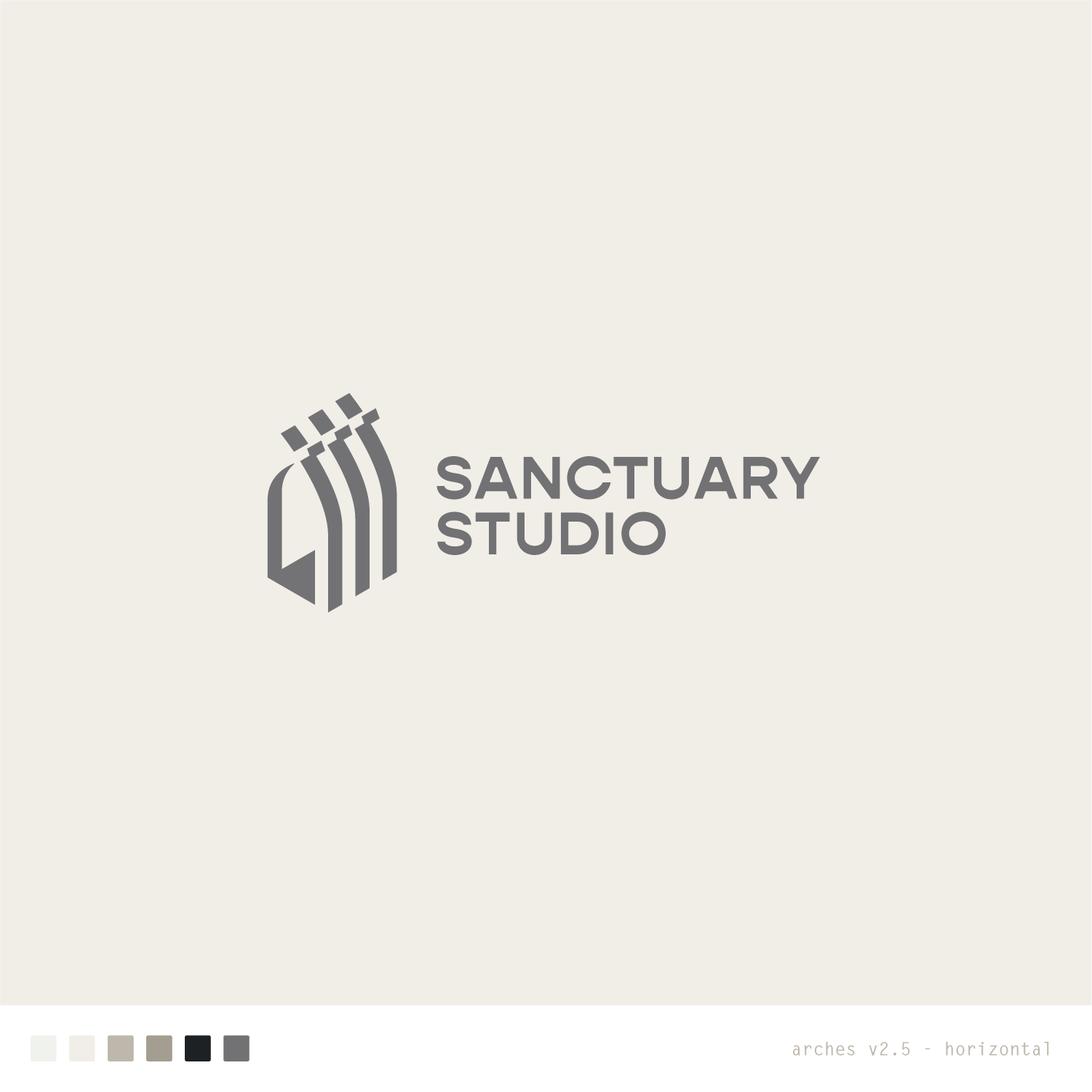
Introducing the isometric perspective.
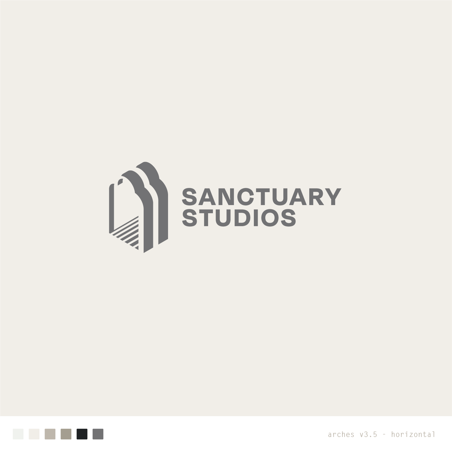
Simplifying the decorative elements of the arch.
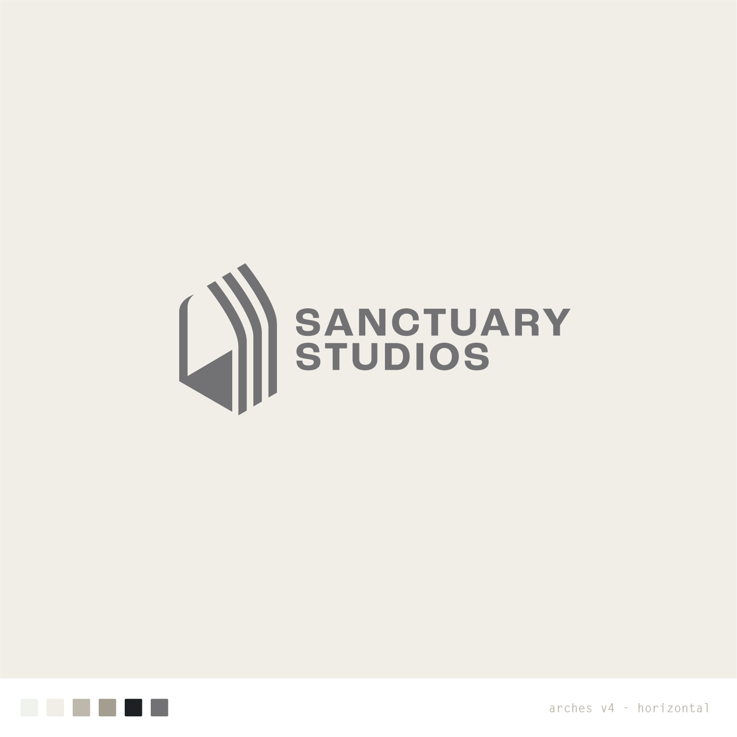
Further refining and simplifying the arches.