K-LOVE & Air1 Content Email Design
The K-LOVE and Air1 networks regularly send out content emails to their audiences promoting new music, giveaways, blog posts and more. While there was great content being sent out, the design of the email needed a pretty substantial facelift.

The Brief
Redesign the Content Email template. Create clear hierarchy of content and with prominent CTA’s. Should be eye-catching and flexible for both brands to use.
The Process
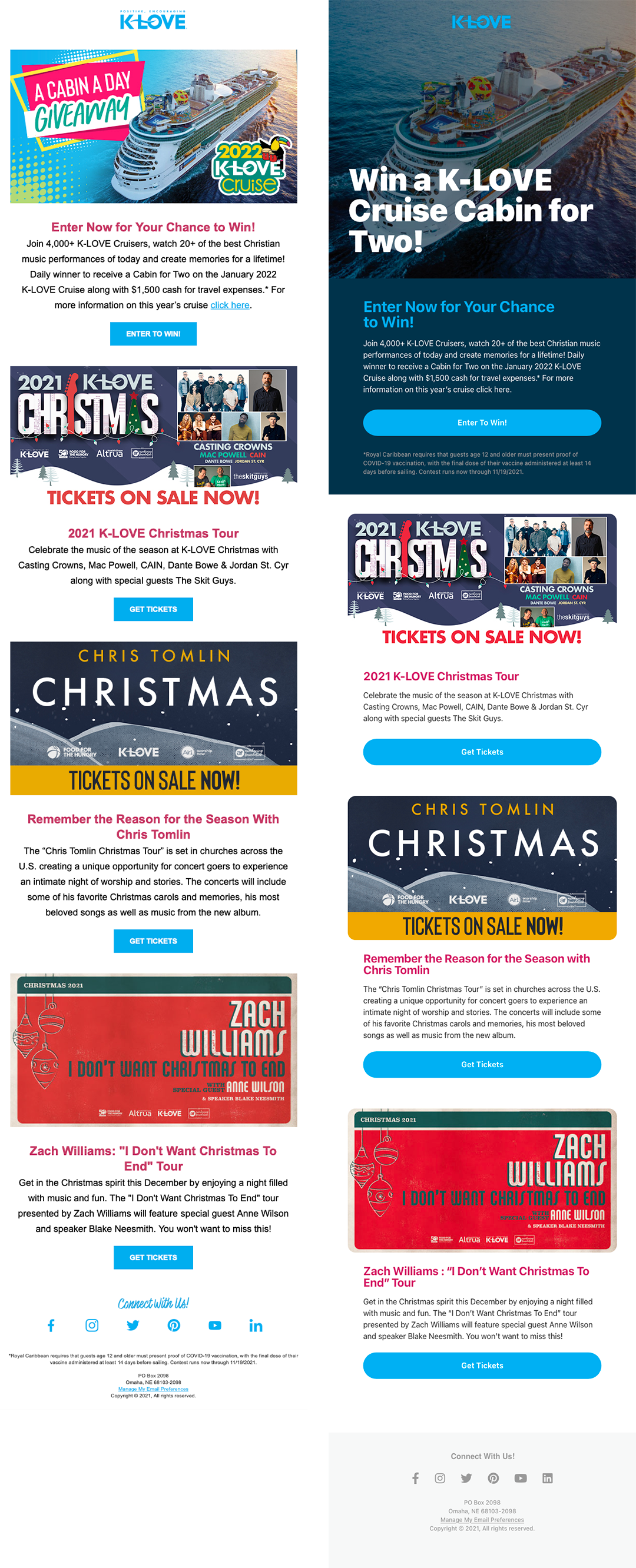
First thing to do was audit the existing template. There were three blocks of content, each with an image, headline, short blurb and CTA button. Everything was center-aligned and relatively uninspired.
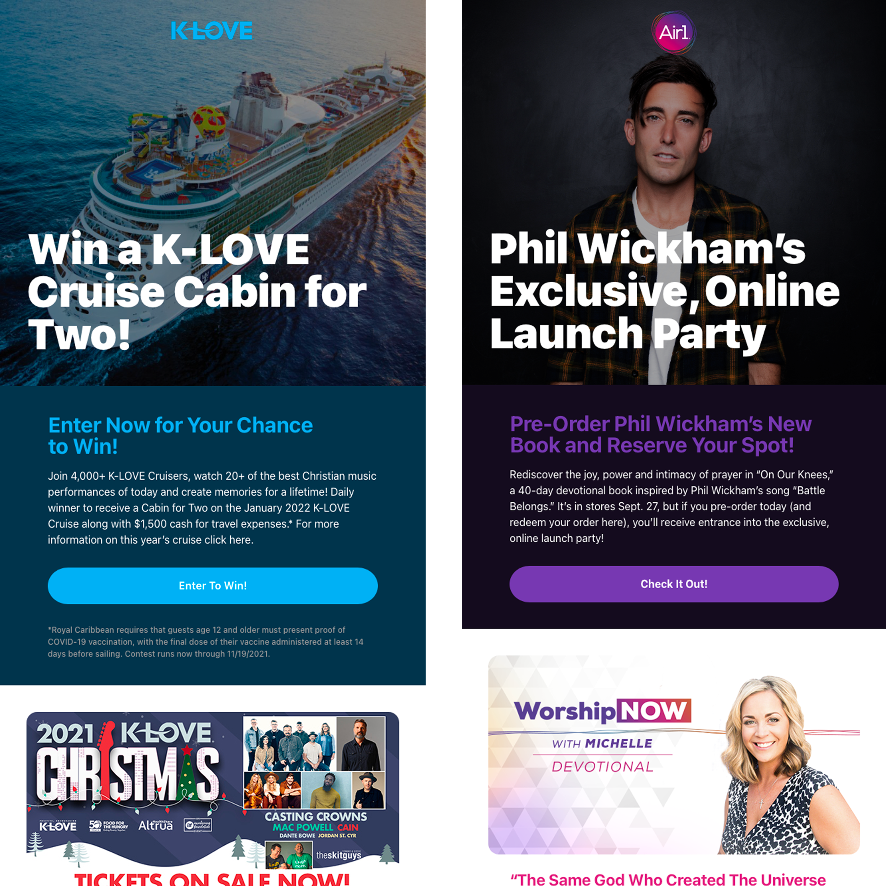
The first step would be to establish a “Masthead” section that grabs the reader’s attention right up front. Next, we can approach the mid-level content a card-style design, with a clear headline and full-width button for the CTA, and rounded corners on the images to make them feel a little more modern.
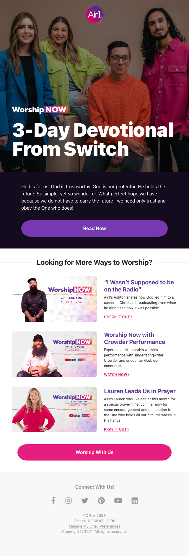
This design translated easily to both K-LOVE and Air1 networks by simply swapping out the brand colors. This layout would ultimately be used as the backbone for many email campaigns to come.

Before vs. After of the K-LOVE General Content email design

A variant of the K-LOVE email design using alternate brand colors.

The email design re-skinned to fit the Air1 brand.

The email design re-skinned to fit the Air1 brand.

The email design re-skinned to fit Air1's Worship Now series.